You are using an out of date browser. It may not display this or other websites correctly.
You should upgrade or use an alternative browser.
You should upgrade or use an alternative browser.
Inter Jerseys
- Thread starter skyline1908
- Start date

- Joined
- Aug 10, 2015
- Messages
- 926
- Likes
- 564
- Favorite Player
- Real Ronaldo

the font looks great
- Joined
- Dec 21, 2015
- Messages
- 20,884
- Likes
- 32,915
- Favorite Player
- Wesley Sneijder

 Best Football Poster
 Best Overall Poster
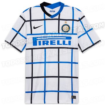
A friend of mine sent me the first official pics of our 2020/21 away jersey this morning to make my day. He even had the audacity to say it looks stunning. 
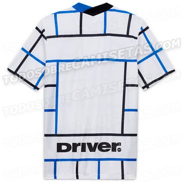
I don't know about you but for me the back is even worse than the front if that was possible.
I don't know about you but for me the back is even worse than the front if that was possible.
- Joined
- Jan 27, 2009
- Messages
- 28,739
- Likes
- 14,506


 Forum Supporter
 10 years of FIF
 FIF Special Ones
 Most Humorous Member
Some of the details are really poor. I mean look at this shit.

There are essentially four "objects" on our shirt: the Inter logo, the Nike logo, the Pirelli logo and the collar. All of them are handled very clumsily. Or rather, the background checker design is a very unhelpful background to work with and completely infringes upon the standard layout of these items.
The Inter badge in particular is handled horribly. They've centered the logo as a whole (circle plus star), instead of centering the circle within the box, and allowing the star to stand out as an offset item. That's why our logo looks so fucking awkward. Not to mention, the cardinal sin I've circled in red: the logo is so close to the border of the stripe What is this shit? It's like printing important business papers from Microsoft Word with the margin set at 1mm so the writing goes all the way to the edge of the page. Just fucking amateur shit.
All the objects on the shirt are completely constricted by the checker pattern. They fight with the background for visual supremacy and they fail to stand out due to a lack of space. Good designs should not have all its objects fighting the background to be seen.
Honestly some of this stuff just leaves me speechless. Like I said, these things are cardinal sins. Unforgivable technical errors. Schoolboy stuff. I can't express that enough.
RE: the back of the shirt. I don't mind the idea they had to make pockets of space in the back of the shirt for the player names and numbers. I really like lettering over a solid color background as opposed to striped. As mentioned though, the checker pattern is just cancer to work with and this particular version is dismal. SPAL have done a good job with this concept:

Hands down this might be the single worst Inter shirt I've ever seen in my lifetime. And that includes this shit:


There are essentially four "objects" on our shirt: the Inter logo, the Nike logo, the Pirelli logo and the collar. All of them are handled very clumsily. Or rather, the background checker design is a very unhelpful background to work with and completely infringes upon the standard layout of these items.
The Inter badge in particular is handled horribly. They've centered the logo as a whole (circle plus star), instead of centering the circle within the box, and allowing the star to stand out as an offset item. That's why our logo looks so fucking awkward. Not to mention, the cardinal sin I've circled in red: the logo is so close to the border of the stripe
What is this shit? It's like printing important business papers from Microsoft Word with the margin set at 1mm so the writing goes all the way to the edge of the page. Just fucking amateur shit. All the objects on the shirt are completely constricted by the checker pattern. They fight with the background for visual supremacy and they fail to stand out due to a lack of space. Good designs should not have all its objects fighting the background to be seen.
Honestly some of this stuff just leaves me speechless. Like I said, these things are cardinal sins. Unforgivable technical errors. Schoolboy stuff. I can't express that enough.
RE: the back of the shirt. I don't mind the idea they had to make pockets of space in the back of the shirt for the player names and numbers. I really like lettering over a solid color background as opposed to striped. As mentioned though, the checker pattern is just cancer to work with and this particular version is dismal. SPAL have done a good job with this concept:
Hands down this might be the single worst Inter shirt I've ever seen in my lifetime. And that includes this shit:
- Joined
- Mar 9, 2004
- Messages
- 5,405
- Likes
- 3,933
 10 years of FIF
I swear the dipshits at Nike are having a laugh. Personally, i think they have a competition going in relation to designing the worst possible and seeing if they can pass it off or get away with it.
We can talk about this shit all we want. The only thing we can do is not buy it.
Uni. seriously Mate, if you want to put your Instagram to good use, rather than worrying about some skanky Kardashian wannabe bitch, when the jerseys are released and advertised, fuckn go to town on them.
That jersey is so horrible it hurts.


- Joined
- Nov 23, 2015
- Messages
- 12,960
- Likes
- 15

Recently a movie was released, Sonic the Hedgehog, which came out later than expected because the fans protested so much about the initial character design of Sonic, that they forced the producers to change it.
We should do something like that: submerge Inter and nike with emails of protest for this horrendous shirt, promising to them that we would not buy it even if it cost 1 euro.
It's so ugly that I find it offensive.
We should do something like that: submerge Inter and nike with emails of protest for this horrendous shirt, promising to them that we would not buy it even if it cost 1 euro.
It's so ugly that I find it offensive.
- Joined
- Dec 21, 2015
- Messages
- 20,884
- Likes
- 32,915
- Favorite Player
- Wesley Sneijder
Best Football PosterBest Overall PosterSome of the details are really poor. I mean look at this shit.
There are essentially four "objects" on our shirt: the Inter logo, the Nike logo, the Pirelli logo and the collar. All of them are handled very clumsily. Or rather, the background checker design is a very unhelpful background to work with and completely infringes upon the standard layout of these items.
The Inter badge in particular is handled horribly. They've centered the logo as a whole (circle plus star), instead of centering the circle within the box, and allowing the star to stand out as an offset item. That's why our logo looks so fucking awkward. Not to mention, the cardinal sin I've circled in red: the logo is so close to the border of the stripe
All the objects on the shirt are completely constricted by the checker pattern. They fight with the background for visual supremacy and they fail to stand out due to a lack of space. Good designs should not have all its objects fighting the background to be seen.
Honestly some of this stuff just leaves me speechless. Like I said, these things are cardinal sins. Unforgivable technical errors. Schoolboy stuff. I can't express that enough.
RE: the back of the shirt. I don't mind the idea they had to make pockets of space in the back of the shirt for the player names and numbers. I really like lettering over a solid color background as opposed to striped. As mentioned though, the checker pattern is just cancer to work with and this particular version is dismal. SPAL have done a good job with this concept:
Hands down this might be the single worst Inter shirt I've ever seen in my lifetime. And that includes this shit:
No need to bring up Spal when we had a great project of our own.

I don't have an issue with pockets per se. The pic I posted has been one of my favorite Inter jerseys. But I hate small pockets as they remind me too much of Siena.
- Joined
- Jun 18, 2010
- Messages
- 5,404
- Likes
- 940
- Favorite Player
- Zanetti
 Forum Supporter10 years of FIF
I actually liked the really away shirt leak but not this!! Why the fuck did they have to break it up at the back too!! You would look like a complete tit walking about on the street if the shirt had no name and number on it!!
Fuck you nike!!! Plus that driver logo too! Fuck you Pirelli!
Fuck you nike!!! Plus that driver logo too! Fuck you Pirelli!


- Joined
- Apr 30, 2009
- Messages
- 12,698
- Likes
- 93
- Favorite Player
- Skriniar

 FIF Special Ones10 years of FIF
- Joined
- Jul 3, 2011
- Messages
- 12,452
- Likes
- 76
- Favorite Player
- ₩€$£€¥
 Forum Supporter10 years of FIF
A friend of mine sent me the first official pics of our 2020/21 away jersey this morning to make my day. He even had the audacity to say it looks stunning.
I don't know about you but for me the back is even worse than the front if that was possible.
Oh dear God. Look what they've done to my boy.


- Joined
- Mar 7, 2004
- Messages
- 35,513
- Likes
- 14,957
- Favorite Player
- Toro, Barella

 10 years of FIF
After zigzag they managed to release even shittier design. Like what the fuck?
Last edited:


