Inter Jerseys

William

Allenatore
Allenatore
Joined
Jun 18, 2010
Messages
5,404
Likes
936
Favorite Player
Zanetti
Forum Supporter
10 years of FIF
Guys maybe it’s a good sign!! We had the similar zig zag “snake skin” shit in 10/11 and that was the last time we properly won anything/ end of an era!

Maybe this marks the return of our trophy run....

:trollol:
 

Puma

Allenatore
Allenatore
Joined
Mar 9, 2004
Messages
5,405
Likes
3,932
10 years of FIF
I get notifications on my phone re: anything Inter related from OneFootball. There was a notification yesterday about our home kit for next season which was basically mocking the zig-zags with a puking smiley face at the end of the notification. Nike's efforts with most of our jerseys are embarrassing and our zig-zag design for next season is simply horrible. I miss our black and blue straight stripes so much.
 

Wobblz

Allenatore
Allenatore
Joined
Aug 5, 2012
Messages
9,187
Likes
646
Favorite Player
Baggio
10 years of FIF
Meh, considering how we swallowed and even got comfortable with this season's jersey I think next one's won't be as disastrous as you guys make it out to be. It always looks different in situ, on players, than what it looks like on a sketchy work-in-progress mockup. I'm not saying the concept is any good, but it won't be as bad as we all think at the end, I reckon.
 

Universe

Moderator
Moderator
Joined
Jan 27, 2009
Messages
28,739
Likes
14,506
Forum Supporter
10 years of FIF
FIF Special Ones
Most Humorous Member
I'll be very surprised if they make something good from the zig-zag concept. If they do, credit to them, even though I believe they shouldn't be doing it in the first place.

As you say, we get used to them, but liking something and merely 'getting used' to something is the difference between the club earning €100 or not, at least for me.

Plenty of our shirts in the past decade have looked great on the players, in situ, during a match. But there has been several years when I've genuinely had the intention of buying the jersey, only to completely change my mind after seeing them up close in the store :lol:
 

Wobblz

Allenatore
Allenatore
Joined
Aug 5, 2012
Messages
9,187
Likes
646
Favorite Player
Baggio
10 years of FIF
The 3rd kit is probably going to kill it, that's all I know.
 

dax21

Capitano
Capitano
Joined
Sep 16, 2017
Messages
3,315
Likes
851
Favorite Player
Bastoni
Meh, considering how we swallowed and even got comfortable with this season's jersey I think next one's won't be as disastrous as you guys make it out to be. It always looks different in situ, on players, than what it looks like on a sketchy work-in-progress mockup. I'm not saying the concept is any good, but it won't be as bad as we all think at the end, I reckon.

To be honest, you get used to a shirt no matter how ugly it is after you've seen your 15th match of the season with players wearing it. I still don't like it, I just don't mind it anymore. It's just there, it exists. I'm probably the person who was most adamantly against the teal/aquamarine/turquoise/whatever the name is away kit this season (and still am), but have to agree that I didn't mind it much in that daytime match against Lecce. Looks less reflective and less shiny without the nighttime stadium lights, and shirt with its plain design with only a single sponsor looked very elegant compared to Lecce's sticker-riddled garbage looking shirt. But fuck it if I have to pull off some 10g mental maneuvers to talk myself into liking something.

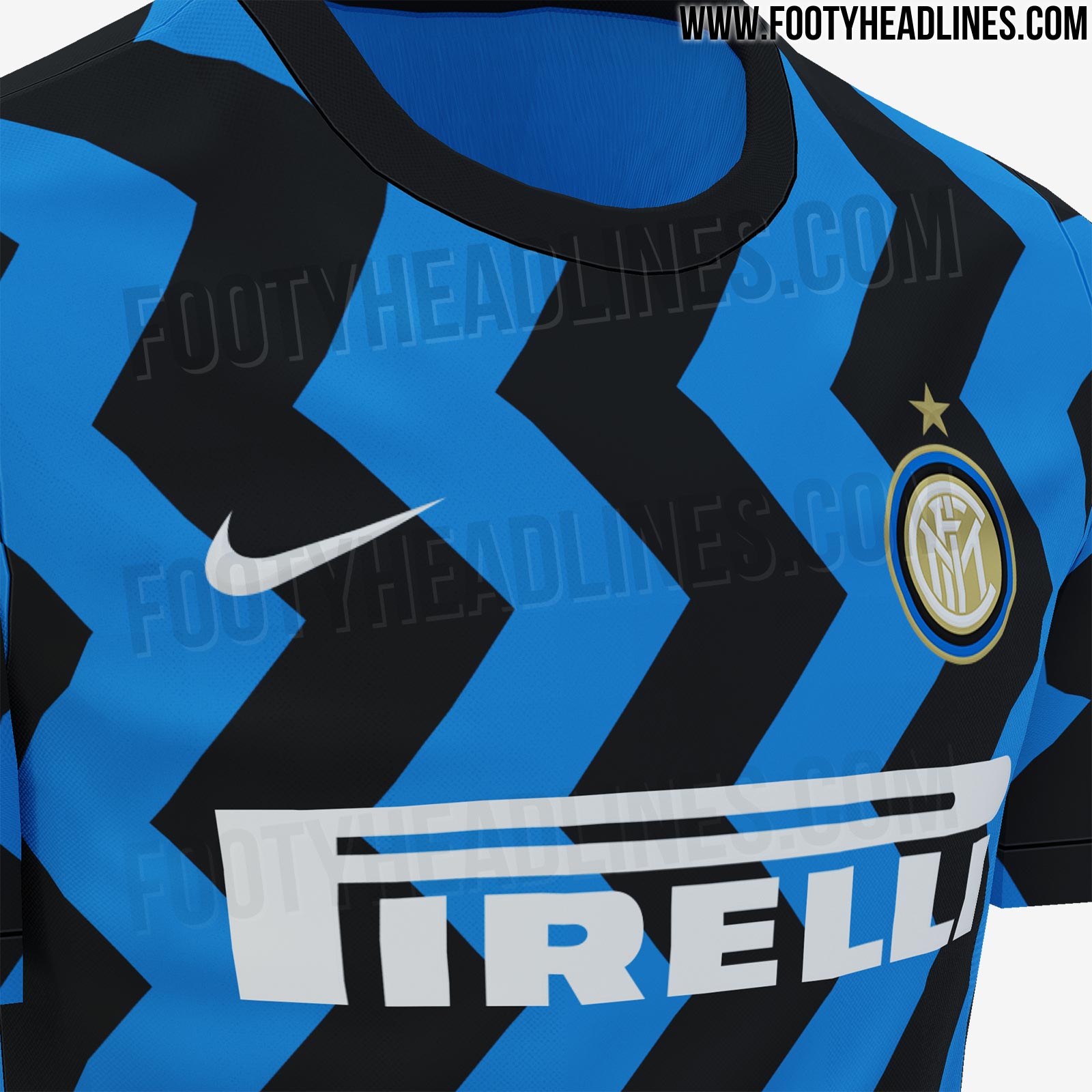
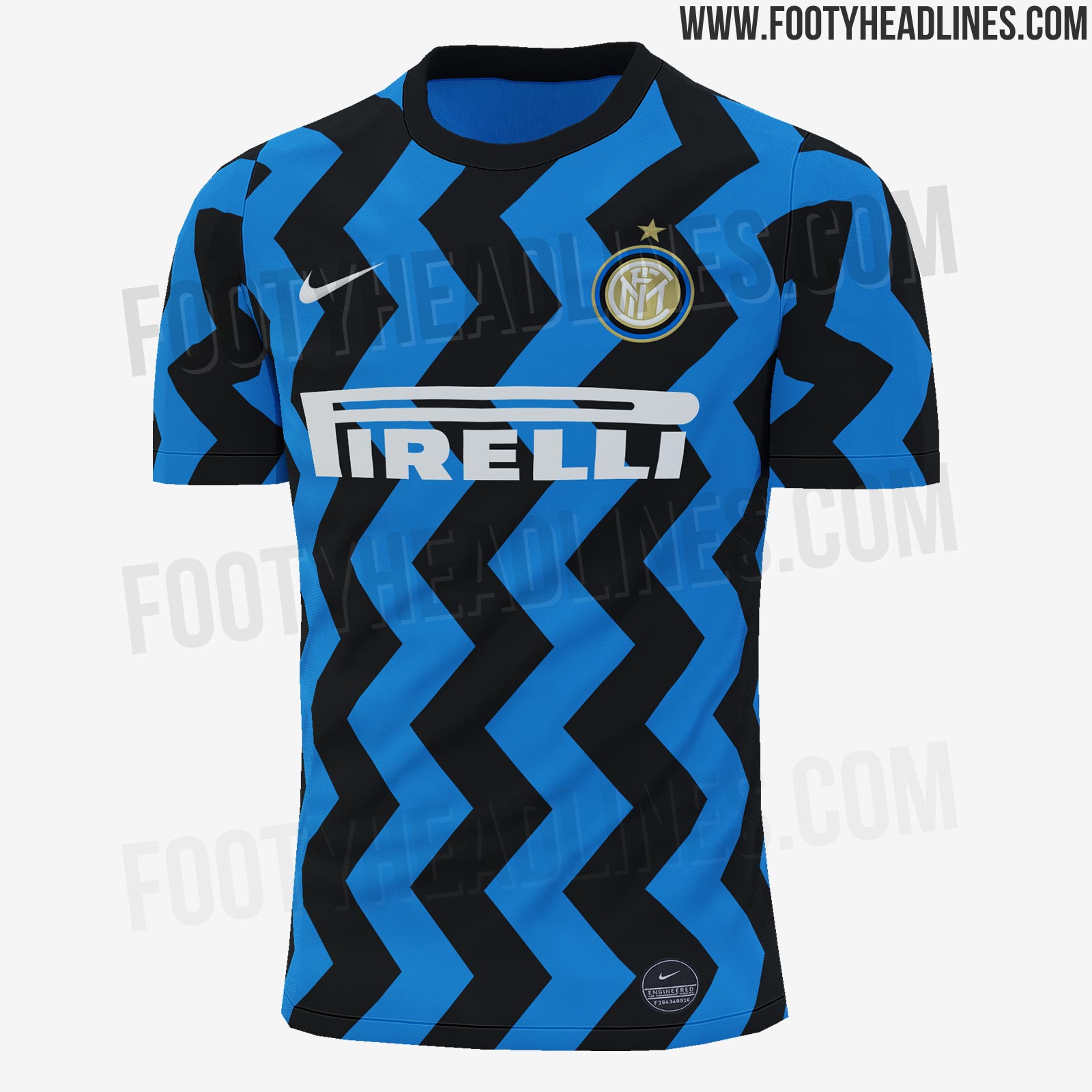
The more the time goes, the more I am simply convinced that whoever is the head designer at Nike is probably a Juve/Milan fan, or a fan of some club that we fucked over in the past, like Barcelona. There is no excuse as to why would we be getting these shit end of the stick designs year after year. I can't think of a top 20 in the world club with departures this drastic when it comes to shirts. Barcelona got their chequered home kit, and sure the fans hated it and talked against it online, but then again it was far from a first experiment for them, nobody knows Barca for their stripes but for their colors.

If zig-zag pattern was such a goddamn necessity, they could've made a small experiment with it in form of dual zig-zag diagonal stripes on a white away kit, which would both be a call-back to our famous away shirts as well as something new.
I wouldn't even be this pissed off about it if Nike were making universally awful kits for everyone, but that is not the case. Current Tottenham third kit, Roma's third kit, Chelsea's third kit, PSG third kit... all in my opinion really nice looking shirts where I wouldn't change anything. Only we get gimmicks and Microsoft Paint designs.
 

Wobblz

Allenatore
Allenatore
Joined
Aug 5, 2012
Messages
9,187
Likes
646
Favorite Player
Baggio
10 years of FIF
The only absolutely fucking awful shirt in recent memory, the one I could never even ignore or grow indifferent to for how ugly it was, was the Sprite-like blue/green abomination of the 16/17 season. This is what I'm basing my "it's not that bad if you stop paying attention" argument. The diagonal mid-section of this season's home kit was "the ugliest thing" and a mocking when the leaks came out, but at least it's not as bad as this shit. Maybe the ALL diagonal jersey is going to line right up with the sprite-kit but maybe they'll tweak it so it's not that bad, maybe just a hint of a slant? Who knows.
 

Native

Allenatore
Allenatore
Joined
Jan 18, 2011
Messages
5,934
Likes
227
Favorite Player
Lukaku
Forum Supporter
10 years of FIF
Anti-Barca
I'm dreading the day they'll give us the same design fifalona has now. Imagine a black & blue finish flag. We would be missing this zig-zag abomination.

But seriously what the fuck even is Nike, such a huge and influential brand mocking football clubs with one cheaply and ugly designed jersey after another. Occasionally to the point it's almost an insult to a clubs legacy. It's as if Nike are trying to damage their own name. It's weird and makes no sense.
 

Lui

Capitano
Capitano
Joined
Nov 25, 2013
Messages
4,785
Likes
122
Favorite Player
Squad Depth
Our 2nd and 3rd kits seem to be very popular this season. It's hard to see us with any other brand but Nike.

Sent from my SM-A520W using Tapatalk
 

Universe

Moderator
Moderator
Joined
Jan 27, 2009
Messages
28,739
Likes
14,506
Forum Supporter
10 years of FIF
FIF Special Ones
Most Humorous Member
More mockups:

Screen-Shot-2020-01-24-at-4-02-58-pm.png


https://www.instagram.com/p/B7n-2o1Ktfa/

Still looks horrendous IMO.
 

Puma

Allenatore
Allenatore
Joined
Mar 9, 2004
Messages
5,405
Likes
3,932
10 years of FIF
Meh, considering how we swallowed and even got comfortable with this season's jersey I think next one's won't be as disastrous as you guys make it out to be. It always looks different in situ, on players, than what it looks like on a sketchy work-in-progress mockup. I'm not saying the concept is any good, but it won't be as bad as we all think at the end, I reckon.

This season's jersey has a semblance of our old school stripes with the exception of the sponsors window where Nike decided to include diagonal stripes. There is no way that zig-zags can be made to look good and no amount of dressing it up is going to make a difference. I have no doubt that it wil be every bit as horrible as we currently imagine.
 
Last edited:

Lui

Capitano
Capitano
Joined
Nov 25, 2013
Messages
4,785
Likes
122
Favorite Player
Squad Depth
It's actually impressive how shit the home and away kit are.

Sent from my SM-A520W using Tapatalk
 

Universe

Moderator
Moderator
Joined
Jan 27, 2009
Messages
28,739
Likes
14,506
Forum Supporter
10 years of FIF
FIF Special Ones
Most Humorous Member
It's actually impressive how shit the home and away kit are.

Sent from my SM-A520W using Tapatalk

Yea, they're quite something.

For me, the home kit is trash because 1) the concept itself is just wrong and unnecessary, and 2) the execution of the concept is equally dismal.

But I actually think from a pure visual perspective, that the away shirt is much worse. There's so many fundamental things so wrong with that away shirt I'm literally stumped as to how something so elementary broken could occur.
 

Materazzi_23

Capitano
Capitano
Joined
Jul 31, 2017
Messages
2,458
Likes
2,716
Favorite Player
Skriniar
The 3th shirt would be great without the blue/aqua lines, don't even want to start talking about the other 2.
 

Black Knight

Capitano
Capitano
Joined
Jul 11, 2014
Messages
3,494
Likes
2,022
Favorite Player
#3, #4
Forum Supporter
I'll have a free morning in Milan the day before the derby. Is it worth buying a(n official) shirt from the Inter store or will it be crowded/out of stock and better off buying online?
 

Lui

Capitano
Capitano
Joined
Nov 25, 2013
Messages
4,785
Likes
122
Favorite Player
Squad Depth
Yea, they're quite something.

For me, the home kit is trash because 1) the concept itself is just wrong and unnecessary, and 2) the execution of the concept is equally dismal.

But I actually think from a pure visual perspective, that the away shirt is much worse. There's so many fundamental things so wrong with that away shirt I'm literally stumped as to how something so elementary broken could occur.

Try not to visualize the away kit with white or matching shorts. I did. Just gets worse.
 

Howl

La Grande Inter
La Grande Inter
Joined
Oct 16, 2011
Messages
14,675
Likes
295
Favorite Player
Diego A. Milito
10 years of FIF
The home and away kits are embarassing. It's as if nursery kids picked up crayons and created those designs.

Third looks nice though, but I'm not sure whether Nike would put the club crest back in the middle of the shirt again as I haven't seen that done for any big clubs in recent years.
 

William

Allenatore
Allenatore
Joined
Jun 18, 2010
Messages
5,404
Likes
936
Favorite Player
Zanetti
Forum Supporter
10 years of FIF
I’m fine with the leaked away one, think it would look nice with some black shorts.
 
Top