Inter Jerseys

CafeCordoba

Moderator
Moderator
Joined
Mar 7, 2004
Messages
35,471
Likes
14,868
Favorite Player
Toro, Barella
10 years of FIF
That full orange kit looks great tbh. Black as the only other color covering logos/texts looks so much better than yellow/white combo in home kit.
 

cocky

Primavera
Primavera
Joined
Nov 9, 2017
Messages
366
Likes
189
Favorite Player
João Miranda
Forum Supporter
that orange jersey is 🔥
 

TheNetworkZ

Allenatore
Allenatore
Joined
Mar 13, 2012
Messages
8,472
Likes
2,548
Favorite Player
The Bro
10 years of FIF
That orange kit looks really nice.

I'm definitely liking the home one still. I'm thinking about getting Acerbi on the back but I'll wait until the end of the transfer window to see our finished squad/numbers.
 

Neroazzurr4

Primavera
Primavera
Joined
Mar 5, 2017
Messages
371
Likes
495
Favorite Player
NotCuntrado
I like third jersey too. I like it a lot better than the second jersey, which is - to put it mildly- ugly af
 

Forzanerazzurri

Prima Squadra
Prima Squadra
Joined
Aug 10, 2015
Messages
922
Likes
560
Favorite Player
Real Ronaldo
I got a sponsorless home jersey. I gotta say this thing is hideous in person. The black part at the top on the shoulders is way too thick.
 

Puma

Allenatore
Allenatore
Joined
Mar 9, 2004
Messages
5,394
Likes
3,925
10 years of FIF
Isn't it usually the case that the jersey is meant to be better in person than it is on TV?
 

William

Allenatore
Allenatore
Joined
Jun 18, 2010
Messages
5,396
Likes
922
Favorite Player
Zanetti
Forum Supporter
10 years of FIF
IMG_9798.jpeg

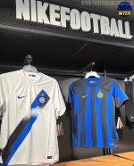
Spotted in a Nike store…
 

nurko

Allenatore
Allenatore
Joined
Apr 11, 2011
Messages
6,467
Likes
915
Favorite Player
Il Capitano
Forum Supporter
10 years of FIF
Out of the past 5-10 years, Nike produced many questionable jerseys but somehow there was always something to like about them, especially home.
This year both home and away raise just one sentiment in me - can't wait for season after so I don't have to see them again.
 

Puma

Allenatore
Allenatore
Joined
Mar 9, 2004
Messages
5,394
Likes
3,925
10 years of FIF
The way the shirt has been cut off at the shoulders by the black and white shoulder bits is shit. So too are the stripes on the home jersey.

But I'm not posting anything that you can't see with your own eyes.
 

brehme1989

La Grande Inter
La Grande Inter
Joined
Jan 17, 2005
Messages
34,623
Likes
17,411
10 years of FIF
Nostradamus
Most Passionate Member
The logo just makes everything much crappier than it is. From 4/10 it drops to 2/10 just like that.
 

Wobblz

Allenatore
Allenatore
Joined
Aug 5, 2012
Messages
9,187
Likes
646
Favorite Player
Baggio
10 years of FIF
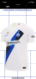
at least the sponsor has no mountain in the away one
Very happy that they went that way, actually the only way. Guess having this pixelated area already established tied their hands, but at least they made the compromise to not include the freaking mountain illustration. All the Paramount branding should've looked this way - way more classier.
 
Top