Inter Jerseys

William

Allenatore
Allenatore
Joined
Jun 18, 2010
Messages
5,420
Likes
960
Favorite Player
Zanetti
Forum Supporter
10 years of FIF
The home kit does an excellent job of demonstrating how our new logo blows. I don't like the color scheme of the away kit at all.
Summed it up perfectly.

The home kit would have had some potential if it were not for the horrendous new logo (hopefully only 6.5 years left till we get a refresh again…).

The away kits ‘aqua’ colour can fuck off.

I’m hoping we do something that Dortmund are trying to do where the lock down shit like the clubs colours on kits etc but that would make sense so of course we won’t.

The third kit I’d need to see how Nike would ruin with some stupid design or pattern but ultimately will be let down anyway with the badge.
 

ElDuccio

La Grande Inter
La Grande Inter
Joined
Mar 10, 2013
Messages
12,079
Likes
3,445
Favorite Player
Il Fenomeno
10 years of FIF
The away is good for Marseille
 
  • Like
Reactions: MVD

William

Allenatore
Allenatore
Joined
Jun 18, 2010
Messages
5,420
Likes
960
Favorite Player
Zanetti
Forum Supporter
10 years of FIF

On the occasion of the Italian Super Cup against Juventus, Socios will replace the “$ INTER Fan Token” logo on the front of the shirt with the favorite song of the fans. You vote on the App until Dec. 19.

Choices:
1 C'è solo l'Inter
2 Olè Inter
3 Sempre e solo Forza Inter
What a scam!!! Kudos to this company for pulling of a globally recognised and highly successful financial scam
 

Sawyer

Capitano
Capitano
Joined
Jul 22, 2007
Messages
3,692
Likes
5,420
Favorite Player
Dimarco
10 years of FIF
Forum Supporter
What a scam!!! Kudos to this company for pulling of a globally recognised and highly successful financial scam
It's bad craic like isn't it.

End of day though, as long as we get paid (Inter) I couldn't care less. If you are stupid enough to "invest" (no offence) that's on you.
 

Ayalon

Capitano
Capitano
Joined
Oct 25, 2010
Messages
1,047
Likes
713
It looks ok, the scudetto patch on the middle black stripe would really bring it together though.
 

Nero Indigo

Capitano
Capitano
Joined
May 21, 2009
Messages
4,734
Likes
669
Favorite Player
Vieri*
Forum Supporter
10 years of FIF
Only to be spoiled by that crypto logo. I actually prefer the MasterCard logo on the women’s jerseys.
 

Puma

Allenatore
Allenatore
Joined
Mar 9, 2004
Messages
5,490
Likes
4,130
10 years of FIF
The MasterCard logo on the women’s jersey looks awesome!
 
  • Like
Reactions: MVD

Ares

Primavera
Primavera
Joined
Nov 22, 2020
Messages
442
Likes
487
Favorite Player
Wesley Sneijder
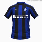
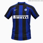
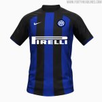
Hi guys, finally seems that we are going back to the classic black and blue stripes for the next year home jerseys, personally I like them more than many others but light blue is what fits the most the history of the club.
Anyway here's a picture:
 

Attachments

  • Home kit2022.jpg
    Home kit2022.jpg
    198 KB · Views: 7

vex

Capitano
Capitano
Joined
Dec 13, 2017
Messages
3,882
Likes
3,952
Favorite Player
Don't have one.
I mean, it's ok, but it also kinda looks like a shirt I would make on pes 6 when I was creating my team in master league. Same fuckin patterns :D
 

CafeCordoba

Moderator
Moderator
Joined
Mar 7, 2004
Messages
36,358
Likes
16,611
Favorite Player
Toro, Barella
10 years of FIF
Do you really need some other patterns?

To me that looks like a very good kit. As long as the sponsor is not some $inter token BS and the colors in the sponsor text are not awkward, I'm fine with that one.
 

eduzee

Capitano
Capitano
Joined
May 9, 2018
Messages
1,675
Likes
1,386
Merge.


William

Allenatore
Allenatore
Joined
Jun 18, 2010
Messages
5,420
Likes
960
Favorite Player
Zanetti
Forum Supporter
10 years of FIF
The home kit was ‘leaked’ early last year too and it turned out to be hilariously fucking wrong…
 

Attachments

  • 3AB8DF88-0736-4650-B015-19EF3EA0568D.jpeg
    3AB8DF88-0736-4650-B015-19EF3EA0568D.jpeg
    89.3 KB · Views: 3
  • 29F05832-11B1-4B1B-A9DB-ADD06CDCEB6D.jpeg
    29F05832-11B1-4B1B-A9DB-ADD06CDCEB6D.jpeg
    102.2 KB · Views: 3

Universe

Moderator
Moderator
Joined
Jan 27, 2009
Messages
28,882
Likes
14,896
Forum Supporter
10 years of FIF
FIF Special Ones
Most Humorous Member

(leaving the Pirelli logo aside for a sec)

The big problem with the new shirt is the weird horizontal stripe running across the collar and collarbone, which bisects the top region of the shirt. Makes it look like a fkn turtleneck.

222222222222222222222222.jpg

Based on the visible stitching / seams, the pink line is the region where they've designated as the front of the shirt. The green lines are the sleeves.

The stripes on the shoulders are fine, but in in this template, the stripes cross over onto the section between the front and sleeves of the shirt. It's a very awkward area for a horizontal stripe which doesn't follow the natural divisions of a shirt, especially with a collar that pronounced. IMO the shirt would be significantly better if literally everything above the pink line was black.

Like so:
444444.jpg
 
Top